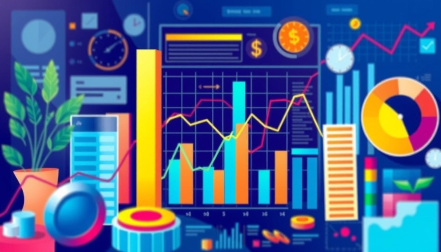
Data Visualization Trends: How to Facilitate the Interpretation of Business Information
Understanding the Essentials of Data Visualization
In an era where information travels at lightning speed, data visualization serves as a lighthouse guiding businesses through the foggy seas of complex data sets. As organizations are bombarded by an endless influx of information, the challenge lies in interpreting this data effectively to make informed decisions. Here, effective data visualization acts as a bridge, transforming raw numbers and multi-faceted data into clear, actionable insights that can drive strategies and outcomes.
Key Elements of Effective Data Visualization
To create impactful visualizations, several essential elements come into play:
- Clarity: The primary goal of any visualization is to convey information understandably. Clean and straightforward visuals, such as bar graphs or line charts, help the audience quickly identify trends or anomalies. An example could be a simple line graph showing quarterly sales; users can easily spot seasonal spikes without sifting through dense spreadsheets.
- Interactivity: Engaging users through interactive elements unlocks the potential for deeper exploration. Tools like Tableau allow users to hover over data points for detailed insights or filter information dynamically—providing a customized viewing experience. For instance, an interactive map depicting sales locations can show performance metrics when users click on specific regions.
- Storytelling: Data storytelling transforms numbers into narratives. By guiding audiences through the data, visualizations can elucidate the implications behind the figures. For example, a presentation might begin with a forceful image of declining customer retention, followed by a series of charts detailing factors affecting customer satisfaction, ultimately leading to strategic recommendations.
Trends in Data Visualization
Incorporating modern tools and techniques enhances how businesses interpret their data, and several noteworthy trends emerge in the field:
- Real-time data dashboards: These dashboards allow businesses to monitor key performance indicators (KPIs) continuously. With real-time data, a retail store owner can instantly view sales performance, inventory levels, and customer traffic, enabling prompt decision-making to optimize store operations.
- Augmented analytics: By leveraging AI and machine learning, augmented analytics automates data preparation and insight generation. This technology can uncover trends that might go unnoticed, offering recommendations based on historical patterns—for example, predicting inventory shortages before they occur.
- 3D data visualizations: Moving beyond traditional graphs, 3D visualizations provide an immersive data exploration experience. Businesses may use 3D charts to represent complex scientific data or spatial analytics, allowing for multiple data dimensions to be examined simultaneously.
Ultimately, integrating these best practices not only simplifies data interpretation but also amplifies an organization’s decision-making processes. By staying abreast of these trends, businesses in the United States can harness the power of data visualization to enhance performance, drive growth, and effectively meet their objectives. Through the strategic application of these techniques, companies can transform their data landscape into a valuable resource, empowering them to thrive in a competitive market.
DIVE DEEPER: Click here to discover the latest trends
The Importance of Choosing the Right Visualization Technique
As businesses seek to leverage data for strategic advantage, selecting the appropriate visualization technique becomes crucial. Each method of visualization presents data in a unique way, influencing how insights are perceived. Choosing the right type can significantly enhance communication and understanding among stakeholders, from executives to frontline staff. Below are some key visualization techniques that can be vital in driving clear interpretations of complex data:
- Bar and Column Charts: Perfect for comparing quantities across different categories, these charts provide a straightforward view of performance metrics. For instance, a bar chart illustrating monthly sales figures across various product lines allows managers to identify which items are underperforming at a glance.
- Pie Charts: Useful for showing proportions and percentage share in a concise format, pie charts can represent how a company’s expenses are divided among various departments. However, they should be used sparingly, as too many slices can cause confusion.
- Heat Maps: Heat maps can illustrate data density across two dimensions, making it easy to spot trends or anomalies. A real estate firm, for example, might use a heat map to visualize areas with the highest property prices or rental demand, thus guiding investment strategies.
- Scatter Plots: Ideal for displaying relationships between variables, scatter plots can help businesses detect trends and correlations in their data. A marketing team might use scatter plots to analyze the relationship between marketing spend and customer acquisition, facilitating more effective budget allocations.
Selecting the right visualization technique is not merely an aesthetic choice; it has profound implications for how data is interpreted and understood. The clearer and more relevant the visualization, the more likely stakeholders will derive actionable insights. Additionally, employing various techniques can help illustrate different aspects of the same data set, allowing a comprehensive understanding of the underlying trends.
Utilizing Color and Design Strategically
In data visualization, color and design elements are essential tools for enhancing comprehension. A well-chosen color palette can draw attention to significant data points, highlight trends, and evoke emotions. For example, using warm colors to represent rising temperatures in climate data or cool colors for declining trends can subconsciously guide the audience’s understanding.
Furthermore, adhering to design principles—such as contrast, alignment, and balance—ensures that visualizations remain accessible. A visualization that respects these principles not only looks appealing but also improves the user’s ability to interpret information rapidly. Applying consistent styles across presentations helps cultivate a routine for stakeholders, making it easier for them to digest complex data every time they engage with reports.
By thoughtfully combining the right visualization technique with effective design choices, businesses can facilitate clearer interpretations of their data. This approach not only fosters informed decision-making but also empowers organizations to stay agile in an increasingly data-driven world.
DISCOVER MORE: Click here to learn how to apply
The Role of Interactivity in Modern Data Visualization
In today’s digital landscape, interactivity is transforming the way data is visualized and interpreted. Interactive visualizations allow users to engage directly with the data by exploring different levels of information and customizing their views. This added layer of engagement fosters greater understanding and allows stakeholders to drill down into details that are most relevant to them. For instance, a dashboard that allows users to filter sales data by region, time frame, or product category enables managers to make data-driven decisions based on their specific needs.
Interactivity can be achieved through various methods including:
- Tooltips: Implementing hover-over tooltips provides additional context without cluttering the main visualization. For example, a tooltip that appears over a bar in a chart can show exact sales figures or customer reviews when the user hovers over it, offering more insight at a glance.
- Drill-down features: These allow users to click on visual elements to explore deeper levels of data. Imagine a line chart illustrating overall company sales—it can be clickable to reveal sales trends within specific regions or product lines, helping stakeholders to pinpoint areas needing attention.
- Dynamic filtering: Users can manipulate data sets through dynamic filters, selecting parameters that interest them the most. For example, if a financial analyst is examining annual budgets, they could filter data by department or years to see specific breakdowns, making their analysis more tailored.
Incorporating interactivity not only makes visualizations more engaging but also supports a deeper level of insight since users control their exploration of the data. As businesses continue to embrace advanced data analysis, adopting interactive visualizations can lead to more informed decisions and improved strategies.
Embracing Real-Time Data Visualization
Another significant trend in data visualization is the adoption of real-time data. As businesses operate in increasingly fast-paced environments, having access to up-to-the-minute data can be critical for immediate decision-making. Real-time visualizations can showcase live data updates, providing insights into ongoing performance metrics, customer interactions, and operational workflows.
For example, financial services firms may use real-time dashboards to monitor stock prices and market trends. This instant access allows traders to react quickly to market fluctuations, optimizing trading strategies. Similarly, in the retail industry, real-time inventory dashboards alert managers to low stock levels or high demand for specific products, enabling them to adjust supply chains proactively.
To effectively implement real-time data visualization, businesses need to consider:
- Data integration: Merging multiple data sources, such as sales data, customer feedback, and social media analytics, into a cohesive real-time dashboard requires robust data integration capabilities.
- Scalability: The system must be capable of handling increased data load as a business grows. As companies expand, their analytical needs will evolve, making it essential to have scalable data visualization tools.
- User-friendly interfaces: Real-time dashboards should prioritize usability to ensure that all stakeholders can easily navigate and understand the visualizations. An intuitive design facilitates quicker interpretation and faster decision-making.
By embracing real-time data visualizations, organizations can stay ahead of the competition, equipping their teams with the information they need when they need it most, ultimately boosting responsiveness and agility in business operations.
DON’T MISS OUT: Click here to discover how AI is reshaping e-commerce
Conclusion
In conclusion, the landscape of data visualization is continuously evolving, with emerging trends that significantly enhance the interpretation of business information. As organizations grapple with increasing amounts of data, the adoption of interactive visualizations allows users to engage deeply with the data, tailoring their experiences to meet specific questions and insights. This capability not only fosters a better understanding but also empowers users at every level to make informed decisions.
Furthermore, the rise of real-time data visualization is proving indispensable in today’s fast-paced business environment. Companies that utilize live data dashboards can quickly respond to market changes and operational needs, maintaining a competitive edge. By integrating diverse data sources and ensuring user-friendly interfaces, businesses can facilitate immediate access to critical information.
The journey toward effective data visualization does not end with interactivity and real-time capabilities; it also involves cultivating a data-driven culture. Organizations must promote analytical thinking among staff, encouraging them to rely on visual data interpretations in their daily decision-making processes. As more employees acquire data literacy skills, the collective ability to harness data becomes a crucial asset, driving innovation and growth.
Ultimately, the combination of interactivity, real-time capabilities, and a culture of data fluency will be key to unlocking the full potential of data visualization. By staying informed about these trends and applying them strategically, businesses can not only improve their decision-making processes but also shape a more dynamic and responsive future.
Linda Carter
Linda Carter is a writer and fashion content specialist who focuses on Shein, online shopping trends, and style discoveries. With extensive experience helping readers explore affordable fashion, understand shopping tips, and make smarter purchase decisions, Linda shares her insights on our platform. Her goal is to empower readers with practical advice and useful strategies to navigate Shein’s offers, discover new trends, and enjoy a more confident and informed shopping experience.